2022 Best in Design/Printmaking – Nicole Kim

Numbers Against Bottles
Print posters
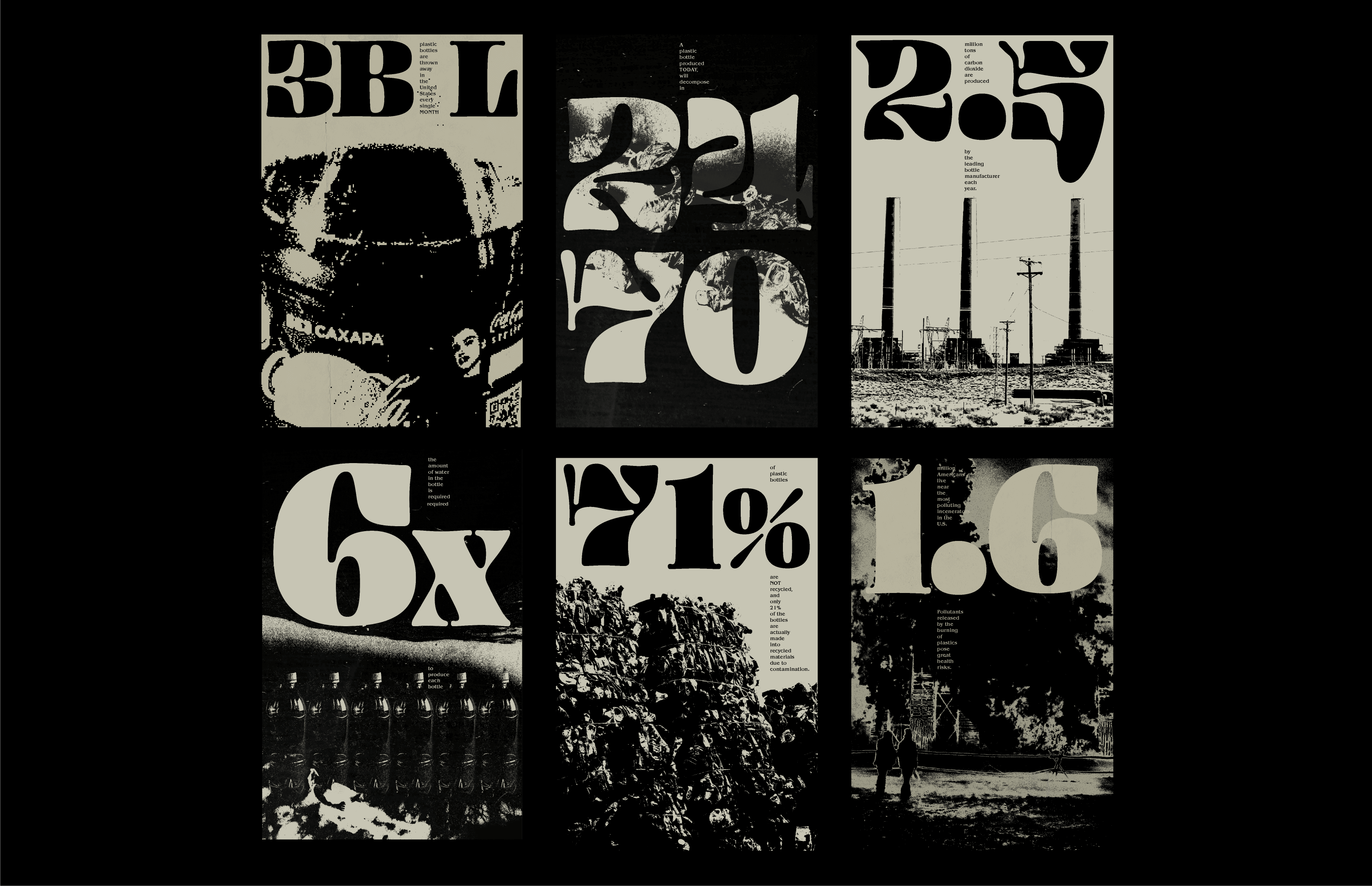
Numbers Against Bottles is a series of six environmental posters designed to be showcased around the University of Michigan campus. Using research to inform my process, the posters were layered with various textures, images, and information, but are visually tied together to build a narrative around the detrimental effects single-use plastic bottles have on our planet.
“Numbers Against Bottles” is a visual exploration of the effects plastic bottles have on our planet. Working with themes pertaining to climate change has been something I wanted to dive deeper into, and this lead me to create a series of environmental posters to advocate against the use of single-use plastic bottles.
Issues surrounding the topic of climate change are becoming more prominent and I strived to create something that will incite an action to be taken by the viewers. Rather than giving people large tasks to save the planet, I focused on plastic bottles, as they are items often used by many individuals, and minimizing the use is a small change that can have lasting effects on the planet.
Because the posters show hard factual data, I realized there may be people who feel disconnected from the evidence being presented. To incite more of an emotional response, I depicted a dystopian tone to create a tangible experience that visually shows what the world will eventually look like if we do not start putting in efforts to change.
I started by making sketches to ideate various concepts. Although single-use plastic bottles is the overall topic, there are subcategories within it, to explain how they have an effect on the various elements of the earth (fire, water, air, and land). Once I drew more fully fleshed-out sketches, I curated a collection of images to include in the posters. I edited the images so they would only consist of two colors. By manipulating the images, I flattened them so they were no longer made of shades and values, but of textures. The imagery is not meant to be easily recognized from the beginning. It pushes the viewers to make sense of the visuals being shown by connecting the textures on the page together.
